Sunday, April 25, 2010
Week 3.2: Through the Fire and Flames
This was a project a did Typography class called Abstract Song Interpretations. I did the song Through the Fire and Flames by Dragonforce. I listened to the song mutiple times to try and understand the feelings behind the song. I ended up taking all the lyrics for the chorus and using those as the big words and the outline for the guitar. I created this as I listened to it and every time they got loud or screamed I made the corresponding word have that feeling in it. For the background I took the full lyrics and made them into a very small typeface and layered it as a background to just put a little bit of texture in it. It looked a bit flat without it so it needed something.
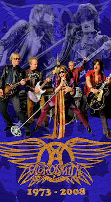
Week 3.1: CD Box Set - Aerosmith
This is the CD Box Set I created for Exit Portfolio. I came up with the idea to do Aerosmith when I was started thinking who I wanted to do for the project. I remembered a few of their older albums and wanted to incorporate those albums in the background and see anyone caught them. The spots in the background are cow spots and then there's the circles on top of those. The cow spots are inspired by the Get A Grip album and the Circles are inspired by the Big Ones album. Aerosmith has multiple logos that are all pretty much the same just changed around a little bit. So for the Logo I just chose the best one i could find and did a little bit of changing myself. I thought about making it just plain white with a faint black shadow underneath, but it didn't look right. So I played with the filters in Photoshop a bit and kinda liked the film grain effect i had it on it. Then I changed the color to gold so this box set would be like a "Gold Edition" or something. The photo of the entire band on top is the best and very high quality photo I could find. I did have a different photo up there but again it didn't feel right and it had a lot of artifacting in it and it was blurry. So I absolutely had to find another photo that was at least print quality, and this photo had a lot of color in it and it was them playing a song and not just posing for the camera. Now the two photos in the top are the two most popular people in the band. Steven Tyler on the left singing a slow song and Joe Perry playing the guitar. I thought of the two photos as a competition between Tyler and Perry because I heard they don't really get along with each other, but they play together like the best of friends and they still sound awesome to this day. It was kinda hard to make the photos of the two look like they were ghosts. The Tyler photo was easy because it was black and white but when I turned Perry black and white and tried to do the same effect it didn't work. So it took me a few days to do that, but i finally got it by playing around with the features a bit.
Tuesday, April 20, 2010
Week 2.2: The Magnolia Bridge
This photograph was taken also when I lived back in Charleston and visited the Magnolia Plantation and Gardens. This one is called The Magnolia Bridge. It is a beautiful bridge and i just had to take a photo of it. With the reflection coming off the water and the architecture of the bridge itself...it is too beautiful not to take a photo. Even though it's nice to have 2 of my family members in this photograph, I think it would have been better not to get them in the photo. (I don't know who the guy on the tree is, but the other guy in blue is my Uncle Harold and the lady is my Aunt Pat.) There are a couple things I could have done better with the photograph, but as an amateur photographer back then I think it came out nicely.
Week 2.1: The Giant Gladiola
Back when I used to live in Charleston, I visited the Magnolia Plantation and Gardens with some of my family that came down to see me. We all walked around the enormous plantation and gardens all day and i took lots of photographs. One photograph i got was of a flower called a Gladiola and it was no ordinary flower. This flower was huge! I took this photograph of it with the pond in the back so you can't really see how big the flower is, but it had to be at least 10 inches across. It was bigger than my head. So this is one of my favorite photographs I have taken.
Tuesday, April 13, 2010
Week 1.2: Twisted Nightmare Magazine Cover
This is the magazine I created for another project at Trident Technical College. The project was to create a 10 page magazine about anything the student wanted to do. I love Rock Music so I chose to do the Top 10 Metal Albums of 2008. Of course this is only the cover, but the inside of the magazine is just as great as this cover. The background is a few of the albums in the top 10 cut into the words Twisted Nightmare Magazine (which is what I named the magazine). The black and white see through stripes on top of the words in the background are the same stripes on the famous Van Halen guitar. The guitar i created in Adobe Illustrator along with the phoenix peace sign on the bottom it. The typeface was a bit hard to read so i doubled the type on top of each other and made them two different colors so they are able to be read easier.
I know you can't see the inside of the magazine, but I'll tell you about it very briefly. Everything in the magazine i created myself except for the photographs. I created my own advertisements, which were fake of course, but they completed the magazine. I even created concert advertisements and new album advertisements. I still have to make a few changes to some things inside of it, but for now I believe this is one of my best creations.
-Brian Howell
Week 1.1: Rock 'N' Roll Stamps
I was asked to create some stamps for one of my classes at Trident Technical College. I first created them to the specifications of the project. Once i was finished and the class was over I had the chance to create the stamps the way I wanted to create them. I chose to stay with the rock theme i had going but narrow down the images on the stamp and make it look as though the image on the stamp went with the stamp itself. The way i had it before it looked like I just put some random pictures on the stamp and called it finished. This time I played around with the colors and the effects in Adobe Photoshop. That was after i had created the drawings and background images in Adobe Illustrator.
I came up with the idea to create stamps with a sort of "dead" or "bone" theme along with the rock theme. So I did a little research about each of the kinds of rock 'n' roll I used and used some sort of iconic image for each. Such as the Mohawk on the skull which is very common in Punk Rock, and the electric guitars in the Heavy Metal, and the "devil horn" sign in the Hard Rock. So there you have it.
-Brian Howell
Subscribe to:
Posts (Atom)